I've certainly appreciated Le Corbusier's contributions to Modern architecture, but I didn't fully embrace his epicness until I visited the Weissenhof at Stuttgart where his work can be directly contrasted with everyone else's (at least those of the German ilk). It is here that you can see, without great effort, how briliantly ahead of the curve Corbu was and how artfully he navigated his work around that curve.
In a profession known for backstabbing, it's notable that Mies van der Rohe, who coordinated the exhibition of Modernism at Stuttgart, fought to include Corbusier as part of the development (arguing that Belgium, the French architect's boyhood home, is, in part, German) and gave Corbusier the most prominent lot to build on (and well as a second neighboring lot). Some muight argue that Mies gave himself the most prominent lot, a large hunka land at the hilltop for an apartment building (then, as now, larger commissions are considered more important), but when you stand before the Weissenhof, you stand before Corbusier. And Corbusier puts everyone in their place.
In this post, we'll walk through Corbusier's stunning duplex, built in 1927, which is now a museum and open for browsing. In Part 2, we'll walk through the rest of the exhibition.
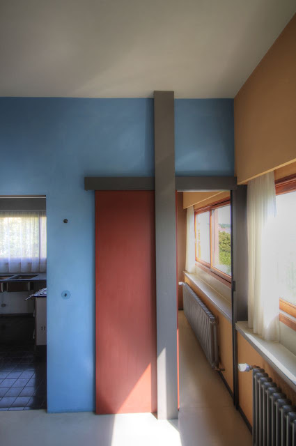
The museum is brilliant: one half is dedicated to documenting the Weissenhof Exhibition and the other half shows Corbusier's original vision for the interiors.
Here's the second floor plans of the duplex with the left unit one bay larger than the right unit.
The standalone house Corbu deisgned to the left.
Entry for the left unit.
The stairwells in these units are breathtaking.
The museum side is painted museum white, but there are exposed parts of the walls to show the original colors.
Several houses in the Weissenhof sadly didn't make it (including a stunner by Walter Gropius). Miraculously, most of the development survived.
The rooftop deck is stellar with stunning views of Stuttgart. This is something you generally don't see in the textbook images of this house: The setting and the views.
Descending into the right unit with Corbu's original colors. This is the office/cubbyhole on the rooftop.
Echos of the Rietveld house with color, neoplasticism, and movable partitions.
People considered the number and size of the windows in these units as scandalous and potentially unhealthy.
The cabinets are movable to repartition the rooms to meet needs.
Another office/cubbyhole.
Love those stairwells!
In the back yard. The main part of the house is white with this back volume, which intersects the main house (and carries onto the roof), a pale green. Kinda makes me feel a little bad that we didn't let the architects paint one of our volumes a pale green...
Original landscaping.
I really want one of these for our front yard...
Front entry for the right unit.
A visual divide between the left and right units.
if you go:
The museum


No comments:
Post a Comment