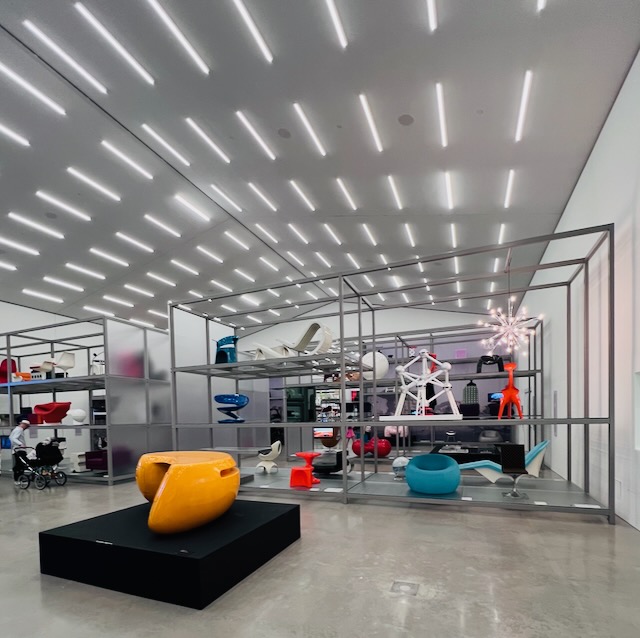
Designed and built between 2013 and 2016, Herzog & de Meuron envisioned an addition to an existing building to complement the older structure while speaking its own language. The architects borrowed the material (bricks) and some of the form creating a minimalist and introverted facade to house a bright and cheery display of chairs. H&M also played with texture by breaking the bricks in half, longwise, and facing walls with the roughage. We missed it, but there's a clever outreach of the new into the old one of the transitions. This building is next to Zaha Hadid's fire station, so it's nice that H&M did not see the need to 'equal' the exuberance of Hadid's piece.
photo from Herzog and de Meuron's webpage
metal chair by Gerritt Reitveld


No comments:
Post a Comment