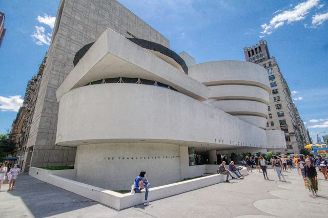
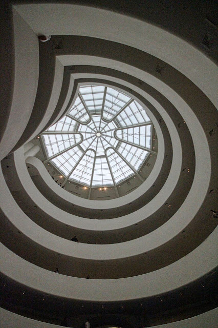
Finished in 1959 after 16 years of design, permitting, and construction, Frank Lloyd Wright's Guggenheim is one of his most iconic buildings. Famously, Wright designed the museum around an upwardly cork-screwing quarter-mile ramp that allows visitors to efficiently view art as they move through the displays. Wright intended visitors to take the elevator to the top and then saunter back down to the ground. The expressiveness of the museum introduced the era of starchitect-designed museums where the the building competed with the art, something artists at the time rebeled against (to which Wright responded that his design was appropriate since architecture was the mother of all art).
Wright developed six separate sets of working drawings for the museum, including a red version. Ultimately Wright (and his clients) settled on the inverted ziggerat we see today, inspired by the ziggerats of Mesopotamia. Wright carried the upward and outward slant of the exterior walls into the main gallery to represent the angle of an artist's easel, something Wright thought was appropriate for displaying art (many artists disagreed, resulting in spacers to present paintings at a vertical orientation). Wright wanted stone on the exterior but used concrete to reduce costs. He died at the age of 91, six months before his only museum opened.
The Guggenheim's shape is striking in contrast to all of the rectilinear artchitecture in New York City. Wrigth wasn't exactly happy about building in New York, but chose a location across the street from Central Park to achieve some connection with the outdoors (although ironically the resulting building is highly introverted). The main atrium is glorious with an enourmous glass dome flooding the interior with natural light (despite reports of no photography allowed, we were allowed to photograph except in the Robert Mapplethorpe exhibit).
The design, for the time, seems a little dated, but that's probably due the 16 years from conception to completion and Wright never being able to distance himself from ornamentation. The white concrete gives the building a 1930s International Style vibe but with a healty dose of art deco in the windows and perhaps a dash of whitewashed Beaux Arts with the glass dome. Nonetheless, the Guggenheim is glorious and a worthy visit.


No comments:
Post a Comment