Drawing for the original permit application (1924).
The story of this little house is a love story. Walking into this home is walking into someone's beating heart. It is an astounding piece of architecture, expansive in its influence on Modernism but also vividly intimate with its intensely personalized spaces. The spirits of its designers waft from the walls and tap you on the shoulders, surprising you with detail after detail, pulling you into their imaginations and lives.
Every structure is a collaboration between architect and client, even if the client's only involvement is to open the checkbook. In some cases, the client pushes the architect to greatness. This is one of those cases.
Truus Schröder
Truus Schröder was born to a wealthy family who owned a textile factory in Deventer, Netherlands. After receiving a degree in pharmacy, she married an attorney more than a decade older than her and proceeded down the set path for a woman of her social standing: staying at home and raising children. But Schröder was a radical at heart, quietly rebelling against the ostentatiousness of her class. She became enamored with early Modernism's forays into art, furniture, and design and convinced her husband to allow her to remodel and decorate one room in their apartment to her liking. She hired Gerrit Rietveld, who had an office in their building, to remodel the room.
The room Rietveld remodeled for Schröder (1921)
Rietveld was born in Utrecht and started his career as a furniture maker, the same line of work as his father. In 1917, seeking a simple chair that could be mass-produced, he designed what would later (after he painted it in the early 1920s) be called the Red and Blue Chair. He joined the De Stijl movement in 1919 and began experimenting with architecture. Based on the chair, Walter Gropius invited him to exhibit at the Bauhaus in 1923.
Rietveld sitting in his prototype chair, 1917.
When Schröder's husband unexpectedly died, she decided she needed a different living arrangement for herself and her three children. Initially, she sought to have Rietveld remodel an existing flat, but ultimately decided to build a house at the edge of town overlooking the polders to the south.
Schröder knew how she wanted to live. The austerity of her remodeled room at her apartment scandalized her friends and family since it did not, to their eyes, reflect her status in society. She sought the same "luxury of frugality" and "soberness" in her home-to-be.
She had a number of requirements: (1) she wanted the primary living areas (dining, living, sleeping) on the second floor where she felt freer; (2) inspired by a friend who lived for a time in an open attic space, she wanted the primary living area to be open yet also be closeable when needed; (3) she wanted flexibility in space and furnishings; (4) she wanted each room to have access to water and drainage; and (5) she wanted each room to have access to the outdoors.
By 1924, Rietveld had designed furniture and remodeled rooms and stores but had yet to design and build a stand-alone structure. The house for Schröder would be his first. Schröder rejected Rietveld's first two designs of the house, pushing the architecture toward a composition of planes. In it, Rietveld expertly employed his design and construction skills as a furniture maker (the details in this house are incredible), the progressive desires of his client, and the tenets of De Stijl, the first and arguably the only architecture that purely reflects the movement. Building codes at the time required walls to divide the functions of the rooms, so Rietveld permitted the second floor as an attic to achieve Schröder's open spaces.

Wooden model for the first design of the house, rejected by Schröder. Rietveld made the next model (lost) out of cardboard and matchsticks, which allowed the two to actively manipulation the design to its final realization.
Finished in 1924, the house was an intervention not only for the street but architecture as a whole. TheSchröder House, along with the Red and Blue Chair, made Rietveld's career; although he continued to design buildings and furniture, his later designs didn't achieve the same influence as these early innovations. He left De Stijl in 1928 for more conventional Modernism, the Schröder House his only architectural contribution to the movement.
A view from the polders: the house in 1925.
Rietveld always shared design credit for the house with Schröder, but, similar to Charlotte Perriand with Le Corbusier and Lilli Reich with Mies van der Rohe, mid-century sexism stripped her name from the project. History has righted that wrong in these modern, and more appreciative, times.
Even though the view of the countryside gave way to a view of an elevated highway, Schröder lived in the house for nearly 60 years until her death in 1985 at 95. Rietveld had an office on the first floor from 1925 to 1933 and moved back in after his wife died. Poetically, he died in the house in 1964. Schröder donated the house and furniture to the local museum.
This house was a major highlight of our trip to Europe and one of the key three architectural stops we made (Corbusier's Villa Savoye outside of Paris and Stuttgart's Weissenhof being the other two). Whereas the other stops were cerebral, this house is both cerebral and emotional.
If you go:
The house is part of the Centraal Museum in Utrecht.
GET YOUR TICKETS EARLY! Because the house is small, there are a limited number of "seats" available. We purchased our tickets a couple of months in advance. It is highly unlikely you can stroll up and get a ticket (they sell out well in advance). You'll see the house with about 15 or so other people. A guide takes you from room to room while you listen to a personal phone thing for details in your language of choice. Photos are allowed, and you are unofficially allowed to "straggle" (as I do) to get shots with no-one in them.
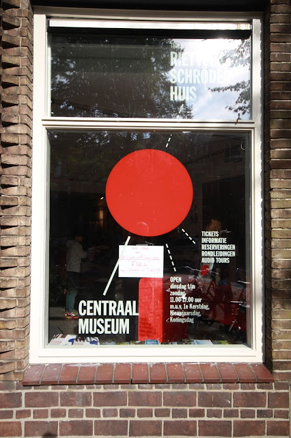
The office next door. The posted paper says "SOLD OUT!"
The museum owns the house next door and uses it as the reception (and requisite gift store) for the house. It also sports a great collection of reproduction Rietveld chairs you can sit in!
Rietveld's furniture in miniature.
Shortly before Rietveld died, a crew filmed an interview with him and Schröder about the house.
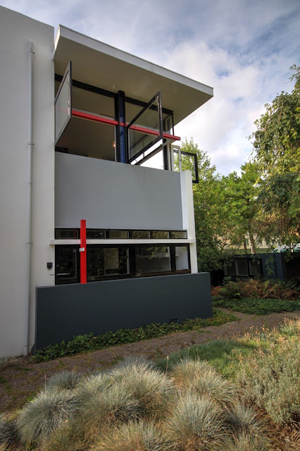
The house is on a peninsula lot, so it has three public sides. The house is generously set back from the street compared to its neighbors.
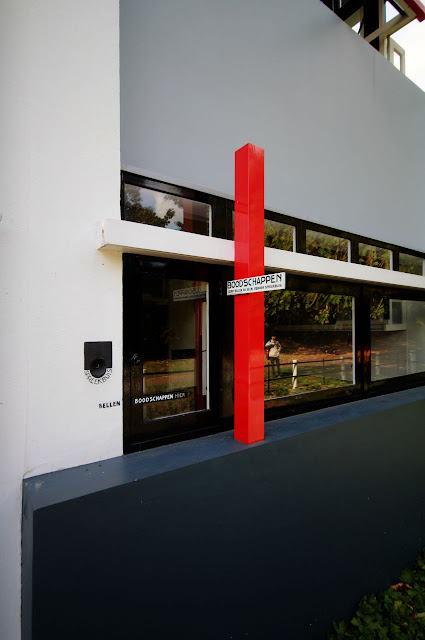
A small window for deliveries (mainly groceries). The black painted square on the left with a small semi-circle on the bottom is a communication tube that reaches to the second floor.
Bench outside the front door.
Large openable windows.
Path to the front door.
Plan for the first floor.
Backside of the front door in the entry hall. The slots on the right were for the family to put their shoes/glove/whatnot. The upper half of the door can be opened for light and ventilation.
Behind the booty box is a place to store umbrellas, including a drain tray at the bottom (all original [well, not the booty box!]).
In the entry hall looking towards the reading room. Place to hang coats; a stoop to begin the ascent to the second floor.
In the entry hall looking across the stoop to the stairwell. The electrical box is affixed to a slab of marble and is revealed to the room.
In the entry hall peering up the stoop and into the stairwell.
In the kitchen and informal dining room.
Kitchen: This is the backside of the delivery window. The blue is a shelf that could be propped up flat when needed.
Kitchen: Looking back to where the oven/stove would go. Note the vent in the top. There are no fireplaces in the house.
This is the first-floor bedroom where the help could stay.
First-floor bedroom looking toward the kitchen. Note the sink in the room as well as the window partition between the two room to pass more light.
This is the studio where Rietveld officed for a time after the house was built.
This is the library. Lots of built-in furniture in this room.
The opposite corner of the library. You can see where this furniture influenced Art Deco as well as R.M. Schindler (and many others).
Plan for the second floor. Because the plan doesn't indicate the utility of the space, I'll refer to directions.
Looking down the stairwell.
Looking up the lightwell above the stairwell. To the right is a Rietveld light fixture. The black panel can be used to control how much light pours into the well and can be used as a sitting perch.
A closer look at that fixture.
Different angle.
Ladder up to the deployed perch. This was Schröder's favorite place to read.
Looking towards the north-east toward the formal dining area.
In the northeast corner looking south. Note the large open window (and Schröder's favorite chair).
Detail of the open window where Rietveld dissolved the corner. Rietveld used structural steel to help achieve this effect.
Another view of the dissolved corner.
I like the thin piece of wood in the ceiling by the light.
View from the bathroom toward Schröder's bedroom, the only two walled-in rooms on the floor.
View of the bathroom from the bedroom.
On the southern wall near the formal dining "room" is where the speaking pipe emerges. To the right of it is...
...this stunningly sculptural storage area!
Gazing from the formal dining area towards a sleeping area to the southwest. Note the colored hardware on the ceiling. This is for sliding panels to close off the sleeping areas.
Closer view.
At Schröder's request, Rietveld designed the beds to double as sofas during the day.
Schröder needed more storage space, so she ordered and installed the two shelf boxes you see here from Sears!
One of the partitions deployed. We were not allowed to film the deployment, but you can watch a video here.
Ceiling view of the partition hardware.
Street context.
The underpass holds a tiled homage to Rietveld's furniture.
The other side of the highway has a couple later Rietveld buildings. I'll share those photos later!


No comments:
Post a Comment