I've written about what it costs to build in the past and how much more it costs here in Austin now that bust quickly turned to boom, but here's a neat update from the neat folks at BUILD LLC in Seattle. I know, I know: Austin ain't Seattle. But I've found that what BUILD had said about building costs associated with their level of Modern (which is one to two steps better than our build) seems to apply here as well.
In 2009, BUILD estimated that it cost $250+ a square foot to build in the pacific-northwest area. This estimate doesn't include architectural and any other associated fees, permit fees, or landscaping. They recently updated their estimates and now say that it costs $250 +/- $50 a square foot to build and that "flawless perfection" adds a minimum of 40 percent to the cost. By my calculation, flawless perfection starts at $350 +/- $70 a square foot. Youch.
It's kinda neat BUILD stuck that perfection cost in there, because I reckon that all clients (especially newbies) expect flawless perfection regardless of the price point of their project. I'm paying a lot of money for this house, right? I know that it was hard to see imperfections in our project as it progressed. I had to keep incanting to myself "Entry-level Modern. Entry-level Modern." If you're building Modern, your price point and how it fits in the spectrum of flawless perfection is something to keep in mind...
bonus related mini-post!
Yapped with a friend last night who lives in the greater Austin area about an addition to their 1980s ranch-style home. Several years ago the project was priced at $150 a square foot. They delayed the project when a new baby surprised them, but are now back on track to build. The cost for the same addition now? $200 a square foot.
another bonus mini-post!
The good folks and BUILD LLC wrote a post about the "iPhone syndrome", the expectation of perfection in the building trade. They note that going from 90 percent perfect to 95 percent perfect adds 30 percent to the cost of construction and that going to 99 percent perfect doubles the cost! They also note that the modern houses you see in national magazines (often the 99ers) start at about $800 a square foot.
10.29.2014
10.26.2014
dancing with architecture: Frank Lloyd Wright's Robie House
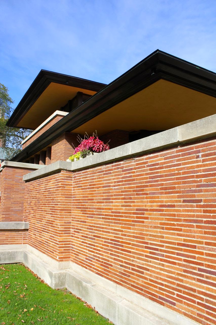
Backside of the Robie House.
Several years ago I stopped in to tour Frank Lloyd Wright's Robie House in Chicago, one of the key early Modernistic houses, if not the key early Modernistic house, in history. It was a good tour, but the house was amidst a major renovation and the bride wasn't with me. So it was exciting to return, bride in tow, to experience the house on the photos-allowed tour.
Something else that was new from my last trip was the next door coffee shop, the Plein Air Cafe, allowing an intimate view of Robie's backside. Good coffee, the best bowl of oatmeal we've ever had, a delicious biscuit, and ample backside views made for a great way to start the day. (With architecture in our eyes, we missed out on the bookstore, a store that a bookish pal later said was the best he'd ever been in.)
Baby got back.
Although not as well known as, say, Falling Water or the Guggenheim, the Robie House is Wright's single most important project. It represented the peak of his Prairie Style, the culmination of the first and most important and original phase of his career, and the spark that inspired Modernism. It was also before his megalomania (aka jackass) phase kicked in.
Wright's primary client base back then was new money (they had no architectural association of what it meant to be rich) associated with technology (they were willing to lean forward on design), and Frederick Robie was no different. Robie was assistant manager and heir apparent to the Excelsior Supply House and had interest in bicycles and automobiles, even designing a bike-based auto. This love of technology and desire to have a different kind of house led him to Wright (Robie's wife, Lora, was surely also an influence, with her parents living near Wright's Dana-Thomas House [1902] in Springfield). Wright designed the house in 1908 and 1909 with construction in 1909 and 1910 (Wright later attempted to predate the design of the house to 1906 so he could lay claim to perspective presentation ahead of the Europeans...).
Unlike his later houses, there's not a great deal of correspondence or drama associated with design and construction. Unlike latter-day Wright, the house was not over budget (in fact, it came in under budget: $58,500 of the $60,000 allotted for the entire project, land and furniture included). Well, there was a little drama: In late 1909 Wright had a mid-life crisis that led to him leaving his wife and six kids for a client's wife (Mamah Cheney), closing his architectural office, and embarking for Europe. However, he left construction oversight of the Robie House in good hands with Marion Mahoney.
This unfortunate turn in Wright's personal affairs led to Wright's catapult from a minor regional influence to worldwide influence. While in Europe, Wright published two volumes of his work with the German publisher Ernst Wasmuth in 1911. These portfolios dropped like atom bombs on Europe's budding Modernists, influencing all the major minds of the time, including Mies van der Rohe, Le Corbusier, Reitveld, Neutra, Schindler, Gropius, and others. And the Robie House was the creme-de-la-creme of Wright's work.
Sadly, the Robies only enjoyed their house for 14 months. Frederick Robie's father passed away in July 1909, leaving a number of debts to settle. And although Frederick was forward thinking on technology and architecture, he was Neanderthalic with respect to women, which resulted in Lora filing for divorce. After two other families lived in the house, the Chicago Theological Society bought the property and used the house as a dorm. In 1957, the Society announced plans to demolish the house to build a proper dormitory. Unusual for Wright, he became personally involved (at 90 years old) in saving the house, organizing a protest and declaring "It all goes to show the danger of entrusting anything spiritual to the clergy." He usually relished the reports of how difficult it was to tear down one of his structures. But even Wright knew that this house was special. He continued to visit the house after its completion, always taking visiting dignitaries to see the house.
After the house was saved (reportedly by the frats!), it exchanged hands several more times before the University of Chicago turned the house over to the Frank Lloyd Wright Preservation Trust in 1997. The Trust is returning the house to its original 1911 glory.
The back door.
A clerestory window for the outside.
Plants above the garage.
I just love this corner view of the house. Lots of interlocking volumes.
Pathway to the side yard.
Detail of the brickwork. Wright was fixated on the horizontal. The bricks themselves are longer than normal, and then Wright also specified that the vertical seams between the brick be flush with the brick and of a similar hue.
The tour guide was disturbed by the use of conventional brick hidden inside the walls behind the plaster. Earlier she mentioned Wright embracing materials.
The ceiling in the billiards room.
Hallway on the first floor.
Latticework in the ceiling of the second floor, the main living area.
The ornamentation of the windows, grates, and woodwork keeps this house from truly being classified as Modern.
From the street, these windows/doors look small, but from the inside they are people height.
Robie's thermostat.
The place had a multi-headed stand-alone shower!
Ceiling in the master bedroom.
A built-in safe for the lady's jewelry. There was also a walk-in safe on the first floor.
I was surprised to see that the roof is tiled!
Stairway down from the bedrooms on the throe level.
The kitchen. Note the cantilevered island.
View of the three-car garage (now bookstore/visitors' center)
Sleek lines and cantilevers.
Can see all three levels here. The balconies square off the doors when viewed from the street.
View of the front and side of the house with a good view of the massively cantilevered roof over the front porch.
Front view. Where's the front door?
There it is! Wright made it an adventure to find the front door so people would have a longer chance to savor the outside of the house. An earlier precedent of the house had a more conventionally placed front door that marred the design.
Careful. Robie house.
Labels:
frank lloyd wright,
starchitect,
tour,
travel
10.25.2014
What is Modern 8: Less is more
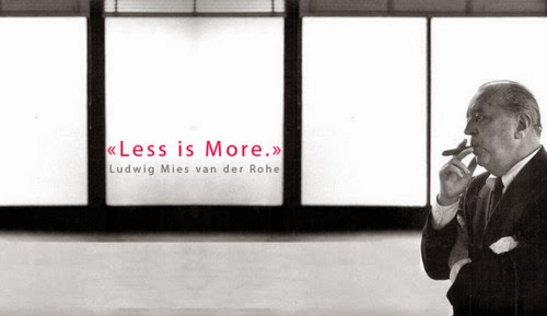
Mies van der Rohe is credited with saying “Less is more”. By
this, he was referring to minimalism in design and construction. Modern is not
fussy and busy. Modern is clean and calm. Mies fretted over every detail and
carefully shaved his designs with Occum’s Razor. If it didn’t need to be there,
it didn’t need to be there. He found beauty in the simple and precise execution
of basic materials. And he carefully thought out every design element down to the
smallest of details. In fact, he also said “God is in the details”.
Minimal baseboard detail via BUILD LLC
Ironically, the corollary to “Less is more” is “Less costs
more”, both in designing and in execution. Not only is God in the details; so
is the devil. Shouldn’t simple cost less? Seems like it, but simple sadly costs
more. Simple details executed flawlessly require conscientious building from
the ground up. That requires a master builder and a hovering architect ensuring
that everything is as perfect as possible from the outset. And that costs money.
Big money. As one architectural firm has noted, flawlessness adds at least 40 percent to the cost of the
build depending on the level of desired perfection. Many of today’s (and
yesteryear’s) building techniques are meant to hide flaws (think of baseboards
and rough-finish drywall) and thus decrease costs because less-trained people
can be used to build. Pure Modern requires a different approach, but “Less is
more” also applies to more affordable Modern.
Mies's Farnsworth House
“Less is more” also applies to material selection. Rather
than mixing and matching a plethora of materials across a house, something
commonly seen in traditional houses these days, a consistent application of
materials is better. For example, we used the same cabinet and counter-top
materials throughout the house including the kitchen, bathrooms, laundry, and
even the built-ins in the master bedroom. Some would say this is boring or even
odd (as an interior designer told us), but this consistency ties the entire
house together and adds to the calmness of the house (and saves having to make
material decisions for every room!).
Subscribe to:
Comments (Atom)


