In 1936 the Armour Institute, later renamed the Illinois Institute of Technology, offered the director of architecture position to Ludwig Mies van der Rohe. Mies was looking for a place to land: After Hitler ascended to power in 1933, Germany was becoming more and more hostile to Modernism (Hitler preferred a Deco-stylized interpretation of the classics; furthermore, the socialist underpinnings of Modernism surely bothered the Third Reich). As the mavens of German Modernism left for friendlier fronts, many of which were in the United States, Mies found the music ebbing with many of the empty chairs of opportunity taken.
Nevertheless, Mies was being quite particular, demanding not only the full ability to reorganize the architecture department (understandable since he would be converting the group from a Beaux Arts approach to a Modern one) but also the ability to redesign the entire campus. The school responded that perhaps he needed to guest lecture for a semester to get a better sense of things. Mies balked while flirting with positions at Harvard (which the more worldly Gropius landed) and Vienna (dead after the Nazis invaded Austria) and a commission for the Museum of Modern Art.
It was a commission to design a house in Wyoming that brought Mies to the United States for a visit and, due to a happenchance day-long layover to change trains in Chicago, tours of Chicago's architectural sites. On the return trip from Wyoming, the Armour Institute asked Mies to visit the school. Mies could hear the music fading and see the last chairs being filled--he agreed to a visit. A one-day layover turned into three. At the end of his visit, he and school had an agreement. Mies would be the new director as well as the new architect for the department and campus.
After developing a master plan, Mies began designing buildings, and in the process developed the architectural grammar he used the rest of his career. His first built project for the school was transitional between the Bauhaus and America: the Minerals and Metals Building designed and built in 1942 and 1943. Here is where he first used I-beams as mullions.
Minerals and Metals Building as originally constructed, 1942-1943. The Mondrianesque pattern on the side indicates the structure of the building and foreshadows what awaits inside.
However, Wishnick (Chemistry) Hall (1945-1946) is where we see Mies start to fully develop the style he applied the rest of his career. Here are the corners with peeks into the inner structure of the building, a refined use of the I-beam mullions, and Miesian modularity.
A "peek" into inner structure.
Details of the brickwork. Mies was a bricklayer early on his pre-architect career.
Notice how the black I-beams stop before ground level.
Mies also designed and built a chapel for the campus between 1949 and 1952, the Robert F. Carr Memorial Chapel of St. Savior. True to form, the chapel is an exercise is minimalism, a simple box (what the kids on campus call "The God Box"). This is Mies's only ecclesiastical building and his only masonry building outside of his early work in Europe.
Front of the chapel.
Inside looking toward the altar.
Close-up of the altar. Because the chapel can be used for other denominations, the cross and curtain is designed so the curtain can be easily placed in front of the cross.
Behind the curtain...
Cantilevered side bench.
View from the altar.
Detail of outside wall.
The back of the chapel from afar.
The most famous building on campus is S.R. Crown Hall (more simply known as Crown Hall). Designed and built between 1950 and 1956, it is considered a masterpiece. Unlike other buildings on campus, this one was only steel and glass. By classifying the building as a warehouse instead of a classroom, Mies circumvented requirements to imbed the steel structure in concrete. However, he wasn't able to build the stairs and patio, fashioned after the Farnsworth House, without railings.
The main entry.
Look familiar?
Note how Mies floats the I-beams off the ground so it is clear that they are not structural. Mies does;t want to lie, so this is an architectural nudge-nudge wink-wink.
The thicker I-beam goes to the ground since it is structural.
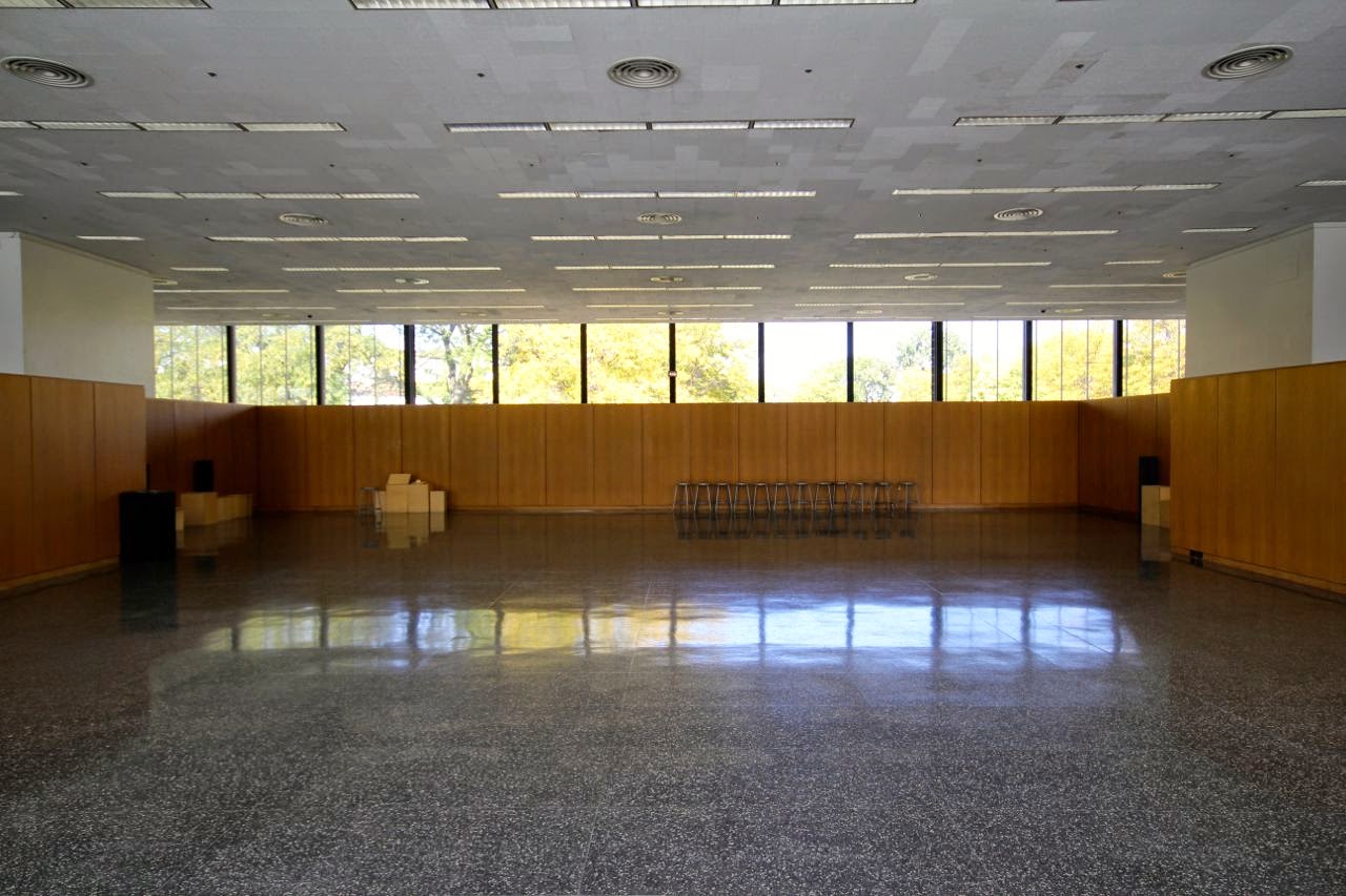
Was surprised to find a lower level!
An homage to Mies at the entryway.
The image at the top of this post is from the entry to the Rem Koolhaas designed student center. In an homage to Mies, the entry has all these small graphics depicting college life such that when you step back far enough, Mies's face emerges.


Hello,
ReplyDeleteExcellent post!
Do you know, by any change, the source of the "Minerals and Metals Building" b&w photo?
Thank you
hmmmm.... Don't recall, and, after poking around a bit, don't see it on the interwebs...
DeleteLooks like I snagged it from here: http://lucassupertramp.tumblr.com ???
Delete