10.17.2015

haiku for the book "A Pattern Language" by Christopher Alexander, Sara Ishikawa, and Murray Silverstein


let us crawl backwards
towards a time of coves and caves
and live in a hole


This book, first published back in 1977, is considered a classic in the architectural oeuvre.
 I'm not sure why. The title comes from how the book is organized, a listing of 253 observations--numbered patterns--of how people like to live, at least from the perspective of the authors. A single pattern may tie into or be associated with several others. Each pattern starts off with a decree followed by a supporting argument about why it is an architectural truth. This is all well and good except that these architectural truths seem to have been written by extra grumpy and exceedingly hairy hobbits fixated on medieval rat-in-a-hole architecture. I half expected to find a pattern titled:
  • Dungeons should be located between four and seven rooms from your master bedroom, far enough away that the screams of your enemies don't keep you up at night, yet close enough that their muffled shriekings lull you to sleep.
That's not to say that the book has no value, but it is a slog, and the gems are far and few between. It's also seemingly somewhat post-Modern in that it is anti-Modern, essentially neo-medieval. However, I did get a chuckle when, after slagging Modernism time after time, it held up the unattributed kitchen from Le Corbusier's Villa Savoye as a good example of a windowed cooking space.

Here are some examples of patterns:
  • There is abundant evidence to show that high buildings make people crazy.
  • Isolated buildings are symptoms of a disconnected sick society.
  • Arrange all toilets over a dry composting chamber. Lead organic garbage chutes to the same chamber, and use the combined products for fertilizer.
  • The presence of children in a family often destroys the closeness and the special privacy which a man and wife need together.
  • Bedrooms make no sense. [this seems to conflict with the previous one...]
  • A building in which the ceiling heights are all the same is virtually incapable of making people comfortable.
  • On no account use standard doors or windows. Make each window a different size, according to its place.
  • People like to watch the street.
  • All people have the instinct to decorate their surroundings.
The authors have socialist if not outright communist tendencies:

  •  Set up processes which encourage groups of 8 to 12 people to come together and establish communal households.
  • Do everything possible to make the traditional forms of rental impossible, indeed, illegal. 
Whatever make your hammer swing, go for it (I say), but this post-hippiness isn't terribly reflective of modern society.

There are, however, patterns that make sense, at least to me:
  • Buildings must always be built on those parts of the land which are in the worst condition, not the best. [sorry Fallingwater...]
  • Unless the spaces in a building are arranged in a sequence which corresponds to their degree of privateness, the visits made by strangers, friends, guests, clients, family will always be a little awkward.
  • If the right rooms are facing south, a house is bright and sunny and cheerful; if the wrong rooms are facing south, the house is dark and gloomy. [Northeastern bias expressed here...]
  • Arriving in a building, or leaving it, you need a room to pass through, both inside the building and outside it. This is the entrance room.
  • When they have a choice, people will always gravitate to those rooms which have light on two sides, and leave the rooms which are lit only from one side unused and empty.
  • Balconies and porches which are less than six feet deep are hardly ever used.
  • There is no substitute for fire.
  • Except in very large rooms, a door only rarely makes sense in the middle of a wall. It does in an entrance room, for instance, because this room gets its character essentially from the door. But in most rooms, especially small ones, put the doors as near the corners of the room as possible. 
  • Dark and gloomy kitchens are depressing. The kitchen needs the sun more than the other rooms, not less.
  • The slab is the easiest, cheapest, and most natural way to lay a ground floor.
  • Surround any natural outdoor area, and make minor boundaries between outdoor areas with low walls, about 16 inches high, and wide enough to sit on, at least 12 inches wide.
  • Make a place in the house, perhaps only a few feet square, which is kept locked and secret; a place which is virtually impossible to discover--until you have been shown where it is; a place where the archives of the house, or other more potent secrets, might be kept.
And there's some stuff that is completely alien to a Modernist:
  • If there is a beautiful view, don't spoil it by building huge windows that gape incessantly at it. Instead, put the windows which look onto the view at places of transition--along paths, in hallways, in entry ways, on stairs, between rooms. If the view window is correctly places, people will see a glimpse of the distant view as they come up to the window or pass it; but the view is never visible from the places where people stay.
Seriously?
  • Houses with smooth hard walls made of prefabricated panels, concrete, gypsum, steel, aluminum, or glass always stay impersonal and dead.
  • A first principle of construction; on no account allow the engineering to dictate the building's form.
  • When plate glass windows became possible, people thought that they would put us more directly in touch with nature. In fact, they do the opposite. [here they propose multi-paned glass]
Associated with the floorpan of Mies van der Rohe's Farnsworth House:
  • The perfectly crystalline squares and rectangles of ultra-modern architecture make no special sense in human or in structural terms. They only express the rigid desires and fantasies which people have when they get too preoccupied with systems and the means of their production. 
Unless you are an architectural diehard, I would not recommend acquiring this book. However, the concept of identifying and collecting patterns or certain "truths" (although there is no truth...) is alluring. For example, why isn't there a pattern language for Modernism?

The inspiration for reading this book was the mention of it at a water meeting held at Wingspread. Developing a pattern language for water conservation, a concise summary of what we (think) we know can be useful, even if some (if not everyone) disagrees. At least a list of thoughts like this allow ideas to percolate to help you decide what are the best patterns for you and your people.

10.11.2015

dancing with architecture: Manhattan, Kansas


I had the pleasure of visiting Manhattan, Kansas, last week (water-water-water...) and was able to walk about the city a couple nights and before heading back to the airport. Some quick factoids about Manhattan:

  •  About 56,000 people live there (not including the 26,000 students at Kansas State University)
  •  Nicknamed “The Little Apple”
  •  The college-oriented businesses near campus are known as Aggieville (The university is the agricultural school of the state). 
  • Birthplace of Damon Runyun, the “Inventor of Broadway” (Guys and Dolls is based on one of his stories.
  • Birthplace of the dude that introduced bamboo, pistachios, and soybeans to the U.S. (thank you Dr. Invasives...).
  • Birthplace of Elvira, Mistress of the Night.
  • The American Institute of Baking is located in Manhattan.
  • It was once against the law to serve ice cream on top of cherry pie in Kansas [don't be messing with my cherry pie].

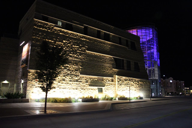
Manhattan is located amidst the Flint Hills, Permian limestones with [you guessed it] a lot of flint in 'em. Not surprisingly, most of the local architecture is composed of or clad in limestone from the hills. 

There's not a whole lot going on architecturally in town, which is not surprising given its size and agricultural (read: conservative) history. However, there are a few interesting buildings. The new airport is rather nice (despite its "fruit stand" baggage claim shown above) with its use of local limestone and even louvres on the windows evoking the broken up layers of the local geology:


I hit downtown one evening to see the sites:

County courthouse.

A nice streamline moderne business front.

Nice abandoned streamline moderne structure.


Modding it up in the front office...

The Flint Hills Discovery Center is architecturally inspired, again evoking the local geology with the limestone and broken beds of the Flint Hills:


 Because the university is a bit away from downtown, it has its own business/party district called "Aggieville".


Nearby is a nice park with a large statue that brings to mind a cross between Paul Bunyan and the Grim Reaper...

Line flushing.


The architecture at the university is focused on the local limestone with nearly every building sporting it in some shape or form. The newer construction reaches backward as far as architectural style goes, although new construction on the edge of campus is more edgy.

The campus art museum is an architectural mess, probably shackled by the benefactor's wishes. Bits at the back were interesting in that they were somewhat modernized interpretations of traditional farmhouses (the pale green window panes against the concrete and limestone are a real nice touch). The main entrance is atrocious: I didn't take photo because I kept vomiting into the back of my mouth. I've added a photo I found at the end here for you to develop your own opinion....


I'm not feeling well: where's the barf bag? "Is this where you check into the Super 8?"

The campus also sports the original antennas for the local radio station. What's cool about these is that in the good old days you had two towers with a wire strung between them to transmit the signal.


There's a fair amount of Art Deco on campus fused with the local limestone.


Built in 1996...


Before heading back to the airport, I made a 15 minute stop to the campus gardens and insect zoo. Yippee!


Bee hive where the bees come and go through that tube.

I hope this was on purpose...


10.10.2015

dancing with architecture: Artesia (with a side of Mentone)

Old church at Mentone.

As we continued our trip to Cloudcroft, we stopped in at Mentone, Texas, (nothing [much] to see here, folks, except) to see the church. We then drove through the eminently quaint New Mexican town of Artesia (daylight photos of Artesia on trip out; nightlight photos of Artesia on trip back).

Artesia got its name from the plentiful (at the time) artesian wells that graced the place (here's another  blog of mine focused on [gulp] artesian well postcards). The water wells stopped flowing by the 1910s to be replaced a few years later by oil wells, which is why the town is exceedingly quaint for its size: it has money (and New Mexico's largest refinery [which isn't saying much...]). Nonetheless, the Yates Petroleum family has a halfway decent eye for architecture.


Despite its small size, Artesia packs a wee bit of an architectural punch with a progressively designed library and corporate headquarters for Yates Petroleum.