When you build, there are always design and build regrets, so here are the ones we have for the cabin. Lemme stress that we freakin' LOVE the cabin and in no way shape or form are these fatal regrets or say anything about the designers and builders. Building a house, a cabin, or anything, really, is a human endeavor wracked with hundreds of decisions by dozens of people. I offer these as something for you, dear readers, to consider as you move forward in your own projects, as well as for us if we ever build again (we're getting older, but may have one more project in us). Many of these are pretty minor or, if things went the other way, they would still be listed here (because we'd be thinking the other way may have been better). In reality, this is a remarkably short list.

1. The backsplash: Due to a miscommunication, the countertop material did not make it up the walls for the backsplash. Once I realized what had happened, I was told that the material was no longer available (hmmmm...). The regret is that I should have pushed on this. I agreed for the tile that went in, but the color is off (although oddly, in this photo, it doesn;t look too bad!). Admittedly, once all our stuff occupied the space, the difference is less visible, but I still notice it. Every. Damn. Time. I still may fix this sometime in the nearish future.
2. The sliding door height: It would have been better for these doors to be taller and match the height of the top windows. The Baby Architect has mentioned this as a design regret. Of course, taller means more bucks (and the mo money may have been formidable), but we didn't discuss it. Not fatal: the space is still remarkable. It just could have been more remarkabler.
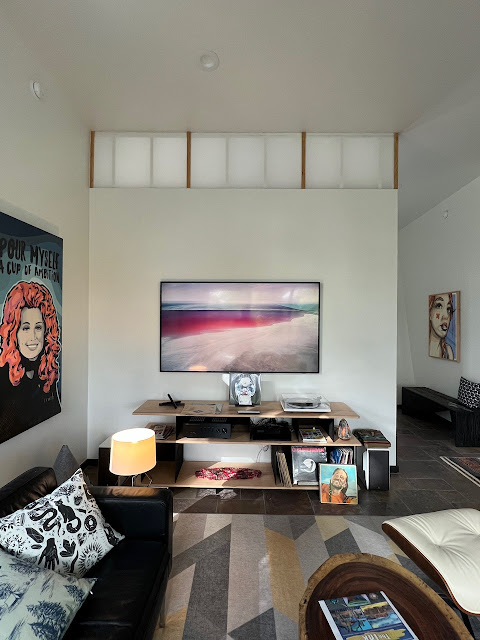
3. More translucence: That top translucent bit is a fave detail of the architect. I've wondered if it should have run down the wall twice the length it does. That added length would have tied the bottom to the top of the other windows and the entry door (and let more light in).
4. The plug disaster: Oops.
5. Back in black fireplace: When choosing tile for the fireplace, I went back and forth (and back and forth) about what color to make the volume that contains the fireplace. Ultimately, I went with a light grey tile to accentuate the linear fireplace. But considering the space as a whole (and the black cabs in the kitchen), I'm now thinking black would have been better. This is also one of those deals that if we had gone with black, I would be posting right about now about now about how we maybe should have gone light.
6. Pillars of Damascus: The internal casing width on these windows was a bit of a shock when I first saw them. Essentially, the window manufacturer cheeseballs their casements together resulting in a pillar three times the thickness they should be. Once it was done, nothing could be done (at least not without substantial cost).
7. White (or black) casements: We also went back and forth on whether or not the casements should be black or white and went (obviously) with white. White works on the interior, but on the exterior, they don't quite look right. Once reason is because the stucco has a hint of brown to it creating enough of a contrast with the windows to be visually irritating. On the other hand, I'm not sure how great black would have worked on the interior. Regardless, if we had to do it all over again, I'd go black.

8. Fat fridge: I really despise how fridges dominate kitchens. Because the cabin is small, we didn't have the option of sliding the fridge into a side pantry. Originally, we had a bump-out in the back wall (similar to our current house) to slide a regular fridge in to be counter depth, but that disappeared after a revision to the plans. So we went with it and went with a more expensive counter depth fridge. But somehow (and for some reason) the damn thing sticks out four extra inches it shouldn't. Sigh.
9. Hidden, but...: Another thing I despise in a kitchen are exposed trash and recycling bins. So we spec'd that these be hidden in our kitchen and wanted something like we have in our house (I provided photos) where you pull on a drawer and out comes the trash bin. On the plus side, we have the hidden cans, but we have to first pull open a door and then pull on the can to slide it out. Minor inconvenience, but immensely irritating nonetheless.
10. Sticky-outy washies: Wished we had spec'd the room to be a little wider behind the washer-dryer to push them back flush with that wall. Cleaner look; more space.
11. Longer washer window: I requested a window in the laundry room for (1) natural light in the room and (2), more importantly, creating an outdoor vanishing point for walking down the hallway (being able to see farther than the wall makes a place feel a lot larger than it actually is). We got that, but, after seeing the window installed, I really wish the window ran down closer to the floor.
12. Fatter bathroom window: I also asked for the horizontal window in the bathroom. One of the moments I love in our Austin house is the ability to look out the shower and see the sky and trees. However, in this case, because the widow is so high, I can only see a sliver. If I had to do it all over again, I would double the height (maybe a little more) of that window. In retrospect, I should requested elevations of these inside walls, something I was not able to imagine. The exterior elevations looked great with this window and the previous one, but it didn't allow me to see how they would work on the interior.

13. Where art thou, shower control: One thing we didn't think about with the walk-in shower was where to optimally place the shower control. As is, you have to step in and turn it on and then quickly retreat, ducking the ice cold water avalanching from above. The controller should have been on the right side of the back wall (with the chevrons) in the photo above so you can turn it on without having your libido smothered. We've got it figured out (reach, turn it on, run!), so no need to feel sorry for us. But as we get older, we'll get slower, so it could be a bit of a challenge.

14. Bathroom wall width: I pointed out some issues with the final plans, including the fact that the plans showed the bathroom cabinet extended past the door jam. It wasn't addressed. I think architects and builders reach a point where they are sick of their client pointing stuff out and therefore simply ignore you (this happened on the Austin house as well). Well, lo and behold, the builder and cabinet maker followed the plans to the T and the cabinet had to be shifted to the left to work.
15. Pooping off-center: However, the cabinet shift created an unexpected issue with the toilet, which is now off-centered (aesthetics) and a little cramped on the left (pooping) side (functionality). Sigh.
16. Not-quite-black slate: Freakin' love the slate floors (the architect's suggestion). Adds a little organic to the modern, but I wish the slate was as goth as it appeared in the photos. In retrospect, I should have asked for samples before making a decision (although we were in a pinch for time at the time). Regardless, it's really nice and we're good with it.
.jpeg)
17. More rainwater, please: The original plans for the bottom floor (walk-out basement) only had room for one 2,500 gallon tank to store rainwater. However, during digging of the foundation, the builder substantially bumped out the basement to include the entire footprint of the cabin. We're wishing that we'd use that opportunity to add another (maybe two?) more tanks. A volume of 2,500 gallons is pretty small for resilient rainwater harvesting for two people. Cloudcroft's annual rainfall is similar to Austin's, and a home in Austin requires 20,000 gallons of storage for a resilient (get through the drought of record) supply. The current tank may be enough during the summer months when local water stress is at its highest (the local population doubles) and rainfalls are daily with the monsoon season. To add a tank (or multiple tanks) now would require tearing a big ole hole in a stucco'd wall. We may do this at some point to help out the village (and perhaps avoid the treated wastewater supply).
18: Square window: In retrospect, I wish we'd put a small square window in the primary closet. We have one in our Austin home, and it's lovely.
19. Side window in second bedroom: Wishing we had put a window in that wall, near the paintings above the sofa. Windows on two sides do a lot to expand a space and make it feel better. I couldn't tell how the land surface intersected with the foundation during the design, but that wall over yonder is fully exposed.
20. Plugs in the second closet: Oddly, we have no plugs in this enormous closet.
Again, we are over the roof in love with the place: it's aesthetics, it's embracing of the forest, it's feel and function, it's future in our lives. We had hopes and dreams for the cabin, and they have been far exceeded. Accordingly, we heartily recommend the architect and builder.


.jpeg)


.jpeg)


